

The Two Deprivations
Are poorer constituencies going green or turquoise?

Which areas of the UK get the rawest deal? Are they the places driving the Reform surge of the past year? Or are they in fact the ones turning the other way – towards the Greens and the radical left?
For a Labour Government caught between a rock and a hard place, this is a crucial question. And the Gorton and Denton by-election last week of course brought it into focus. Both Reform and the Greens presented themselves as the true party of the workers and the have-nots. And both managed to break through – pushing Labour into third place in a constituency which is the 15th most deprived of 543 in England.
The ‘existential’ crisis this creates for Labour is not only electoral, but is about political identity. How can a party which sees itself as representing society’s poorest reconcile itself with losing a constituency so clearly at the economic sharp end? And does it need to tack left or right to avoid the same fate elsewhere?
Politics and deprivation
We’ll return to look at Gorton and Denton in a moment, but first let’s examine the broader link between deprivation and 2026 UK politics.
The English Indices of Multiple Deprivation (IMD), which came out last year (and which have been deduced to constituency level by the House of Commons Library) lets us do this. We can compare the findings with the most recent MRP poll by More In Common (MiC), from January, which projects the constituency distribution of the Reform and Green votes.
The scatter chart below shows what happens when we do this. It compares overall deprivation levels (vertical axis) with the projected Reform vote in each constituency (horizontal).
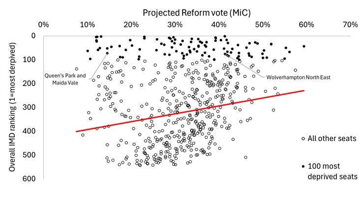
This indeed reveals a correlation between deprivation and Reform enthusiasm (marked with the red line) – but a fairly mild one. The correlation partly occurs because the least deprived areas tend to eschew Farageism. The affluent dots at the bottom of the scatter rarely have an above average Reform vote.
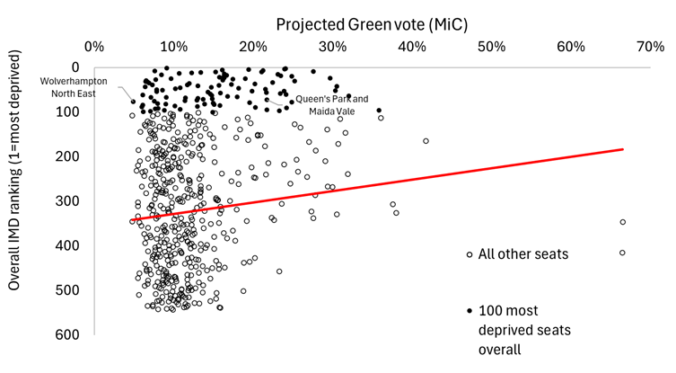
The next chart, meanwhile, shows what happens when you do the same thing with the projected Green vote. The Green percentages are lower, hence the dots are further to the left. But, as with Reform, there is a mild correlation with deprivation. Again, this is partly because the best-off areas tend to snub the Greens, as they do Reform.
In fact, one general trend which comes through is that the poorer a seat is overall, at the area level, the more likely its electorate is to back newer or fringe parties. Amongst the 100 most affluent seats, the average combined Green-Independent-Reform vote is 40%, but it rises to 53% among the 100 most deprived.
At any rate, in summary both Reform and the Greens over-perform somewhat in deprived places, according to MiC’s polling. But only in some deprived places, in the case of each. The Greens have no traction in the case of Wolverhampton North East, for instance, marked on the map. And Reform are making few inroads in Queen’s Park and Maida Vale.
Before moving on, it’s worth quickly looking at how Labour does. The scatter to the left shows the 2024 General Election vote, and the scatter to the left shows the January 2026 MiC projection which we’ve been using up to this point.
As we can see below, there is again a trend towards more deprived seats for Labour – again with a large number of outliers. Obviously, the Labour vote has declined considerably. And it is worth noting, when we look between the two, that very deprived seats – the 100 that are infilled in black – seem to have particularly fallen back.
Types of deprivation
The above analysis only tells us so much. More light can be shed, however, using the IMD’s seven sub-domains. These are:
· Employment deprivation
· Education training and skills deprivation
· Health deprivation and disability
· Crime deprivation
· Income deprivation
· Housing and service deprivation
· Living environment deprivation
Each is produced and ranked using a robust selection of metrics, and each contributes to the overall score an area is given by the IMD.
By looking at these sub-domains we see something clearer. Places may be close to each other in the rankings for overall IMD score. But dramatically different things are happening beneath the surface.
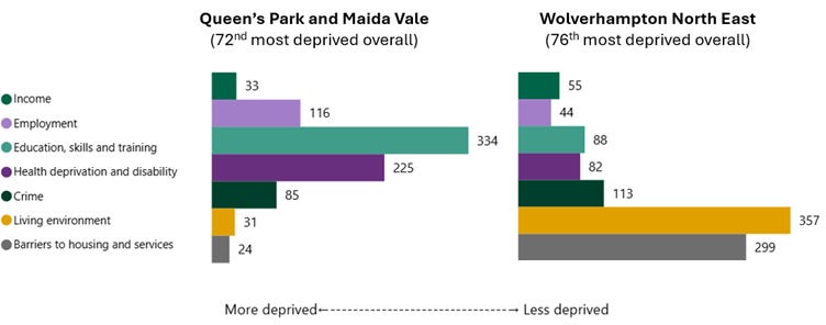
For instance, Queen’s Park and Maida Vale in west London is 72nd of 543 seats for overall deprivation and Wolverhampton North East is 76th. The former has a projected Reform vote of 15% and a projected Green vote of 22%, however, whereas the numbers for the latter are 41% Reform and 5% Green respectively.
These seats may sit just a couple of rankings apart for how poor they are overall, then, but they have very different politics. And once we scratch the surface of the IMD data, we see how different they really are in socio-economic terms as well.
Queen’s Park and Maida Vale is much more deprived when it comes to the housing/ service access and living environment deprivation domains. Wolverhampton North East does far worse for educational opportunities, employment and health.
These two constituencies exemplify a wider pattern – with massive geographical differences in terms of how socio-economic challenges are experienced. The chart below shows the regional breakdown of the 100 poorest constituencies according to each IMD sub-domain, for instance. (England’s overall makeup of seats-by-region is shown to the right, as a benchmark).
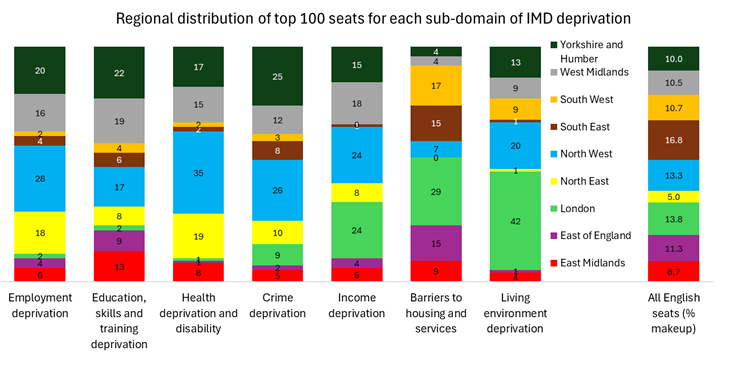
The north and midlands are significantly over-represented in the top 100s for the health, education and employment sub-domains. And London is massively overrepresented in the top 100s for income, housing and living environment deprivation.
Flowing from this are political differences. The chart below looks at the average party support in each of the 100 most deprived seats for each sub-domain.
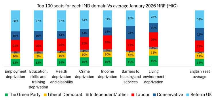
Places with high employment, education and health deprivation are more likely than average to back Reform. Places with housing and service deprivation, living environment and (to an extent) income deprivation are less likely.
Another way of looking at this is by drilling into the areas of greatest strength for the parties. The chart below picks out the average rankings for the 100 seats where the five main parties are projected to perform most strongly by MiC.
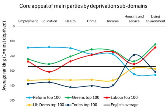
The constituencies where Labour and the Greens’ core appeal is concentrated are fairly similar. The Tories and Lib Dems are much more affluent in terms of their current ‘heartlands’, meanwhile, and barely compete in poorer areas at the moment. (An exception is on housing and service access, with the Tories’ appeal being in rural areas where the ‘service access’ aspect of the sub-domain is a barrier).
But the 100 areas where Reform is strong are the most distinct – characterised by much higher average deprivation in terms of employment, education and health, and much lower deprivation in terms of housing access and living environment. Farage’s primary appeal is in places with low house prices and a lack of jobs and training opportunities.
In-work poverty versus worklessness
Two of the sub-domains, in particular, are useful to look at further. Income deprivation and employment deprivation are the most important sub-domains in the IMD methodology, and tell us a great deal.
Income deprivation is based on levels of in-work benefits – including housing benefits – whereas employment deprivation is mainly based on out-of-work benefits. At first glance the two might be assumed to measure something similar. But there’s less overlap than you’d expect. And by analysing the differences we start to see something interesting.
In constituencies which are ranked higher for employment deprivation than for income deprivation (i.e. with issues like worklessness more pronounced), Reform UK tend to over-perform. In places ranked higher for income deprivation than employment deprivation (i.e. with issues like in-work poverty more pronounced) the Green vote tends to be above average.
The charts below show this. The first ranks all 543 English seats for the gap between employment and income deprivation – with plus scores on the vertical axis indicating a higher employment ranking than income (which I’m calling ‘worklessness’ as a shorthand), and minus scores indicating the reverse (which I’m calling ‘in-work poverty’). The chart compares this to their projected Reform vote (horizontal axis).
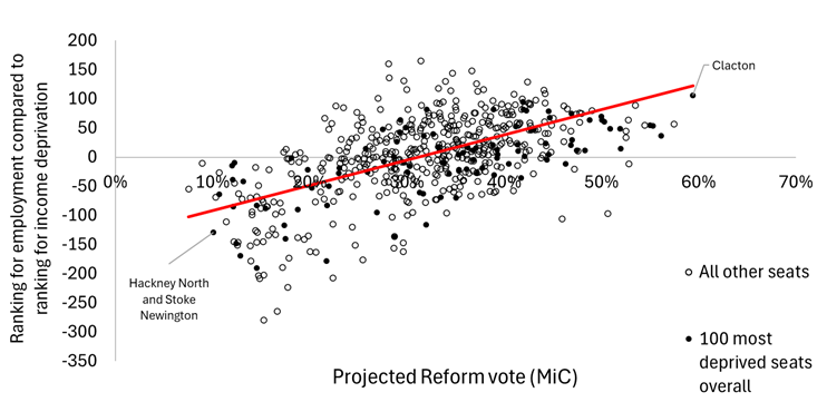
As we can see, places which are more deprived for employment than for income are much more likely to vote Reform – with few major exceptions. The average Reform vote is 37% in places where worklessness is the bigger issue, but only 26% in places where in-work poverty is more evident.
With the Green vote meanwhile, the pattern is reversed – as the next chart shows. Almost nowhere with higher worklessness than in-work poverty has a substantial Green vote.
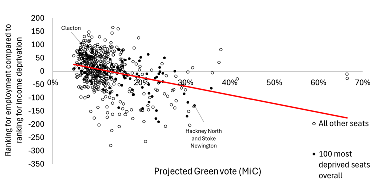
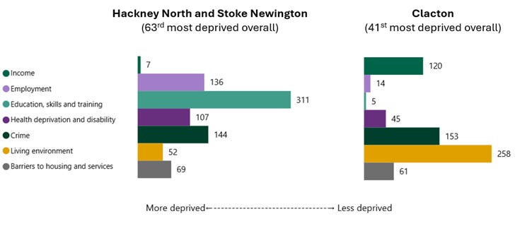
The two examples picked out illustrate this. Hackney North and Stoke Newington is 136th for employment deprivation, but is the seventh most income deprived seat in England – a score of -129 according to my deductions.
Nigel Farage’s own seat of Clacton, by contrast, is 120th for income deprivation but 14th for employment deprivation – a score of +106. It is a more affordable area to live if you have a job, but opportunities for work are scarcer. Its politics, as we know, are wildly different from Hackney’s. And it feels very different to Hackney as a place, partly for reasons which derive from these economic differences.
Income, employment and Brexit
The above is more than just an oddity in the numbers. If we look at the geography of in-work poverty and worklessness, we get a map that is eerily similar to the 2016 distribution of the Brexit vote. Places where in-work poverty is more acute are mostly in areas that voted Remain. Places where the opposite is the case tend to have been Leave-leaning.
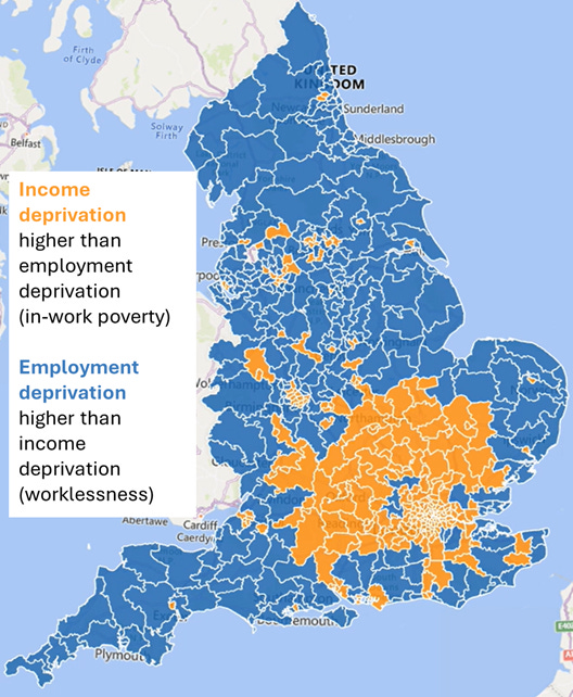
The distribution also mirrors Brexit (as the chart below shows) – in that places where in-work poverty is more pronounced are less common, but the numbers are more extreme.
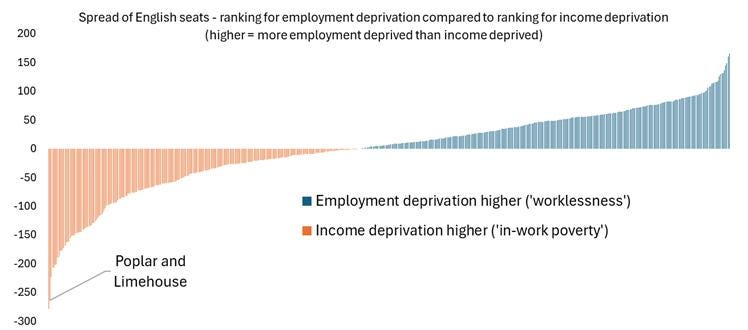
Poplar and Limehouse, for instance, is ranked 308th for employment deprivation but 44th for income deprivation – giving it a score of -264 according to my measure. You can potentially get a job if you live there, but may really struggle to make ends meet all the same.
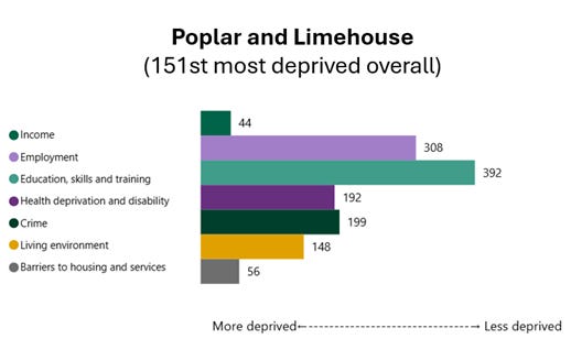
There are more seats at the other end of the spectrum, by contrast (i.e. with more worklessness than in-work poverty). But the slope is less steep, and none have a ‘plus’ number as high as Poplar and Limehouse’s ‘minus’ number is low.
The interplay between income and employment deprivation is clearly not incidental, then. What it really points towards is a massive difference between places with more successful local economies – where it’s expensive to live off what you earn thanks to high demand and pressure on services – and places with less successful economies – where there are less jobs and fewer opportunities.
Gorton and Denton revisited
This brings us back to Gorton and Denton. The chart below shows the sub-domains for the seat, indicating an unusually flat set of rankings. It is deprived according both to the metrics which point to Reform-voting (education, health) and to those that point to Green-voting (living environment, housing). Income deprivation is worse than employment deprivation, but by a relatively small margin.
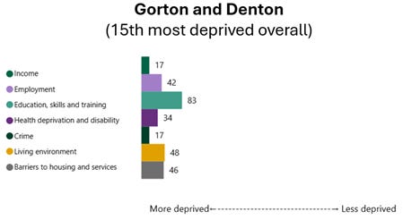
Deprivation is not destiny, of course, but this might help to explain why both the Greens and Reform managed to surge as they did in the seat – with the former coming out on top.
The bar chart above likely masks big internal differences, meanwhile, within the Gorton and Denton constituency. As Professor Rob Ford pointed out before the vote:
Gorton and Denton is a Frankenstein’s monster constituency... The seat is shaped like a battle axe, with the handle running Southwest through diverse and gentrifying wards in Manchester city council, while the head of the axe in the Northeast covers the three Tameside wards of Denton. Though both parts of the seat have long voted Labour, they are poles apart demographically… But the two chunks of the seat are not equally matched – about two thirds of the population live in the more diverse, graduate and student heavy Manchester wards.
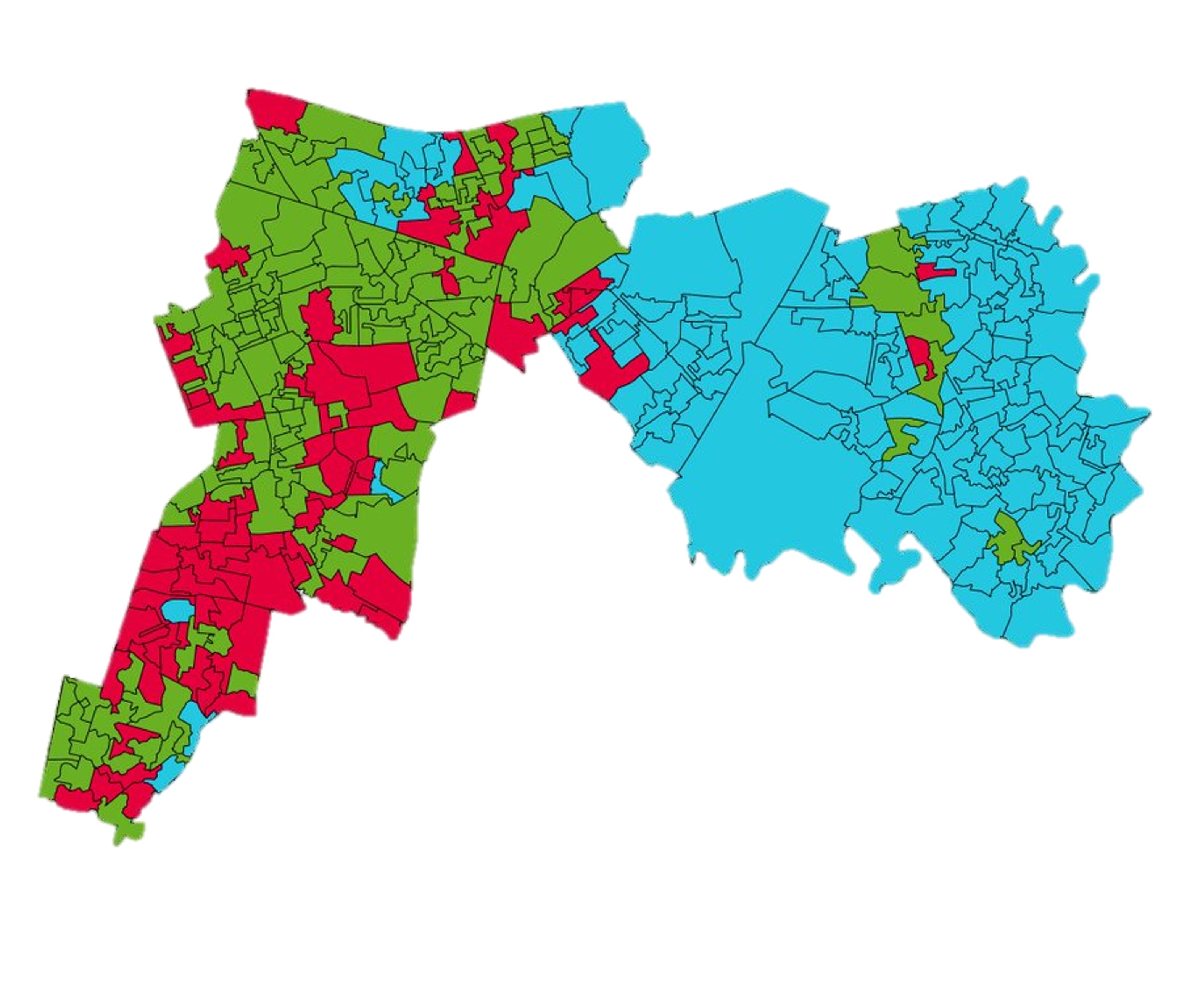
(The map at the top of this piece, which is based on online estimates of the vote distribution, very much corroborates this).
Ford was primarily highlighting that the Gorton wards closer to central Manchester are younger and more diverse than the Denton wards further out. But the forms of deprivation are, correspondingly, very different as well. The more Green-leaning Gorton part of the seat has 38 individual neighbourhoods (or LSOAs) of which all but 4 have higher in-work poverty than worklessness. The more Reform-friendly Denton, by contrast, has 23 neighbourhoods, all but one of which have more pronounced worklessness.
This is only a small part of the picture in the by-election result. But even within a single seat we get a sense of how different types of socio-economic challenge end up being articulated via diametrically opposed politics.
The two deprivations
Taken together, the above analysis points to two types of deprivation. They embody different challenges, local experiences and living conditions.
The table below sets out the core characteristics, based on the analysis above as well as on some other public datasets I’ve cross-references against. I have called the two deprivation types ‘behind the glass’ and ‘back of the queue’, for speed, although I appreciate that these labels are themselves tricky.
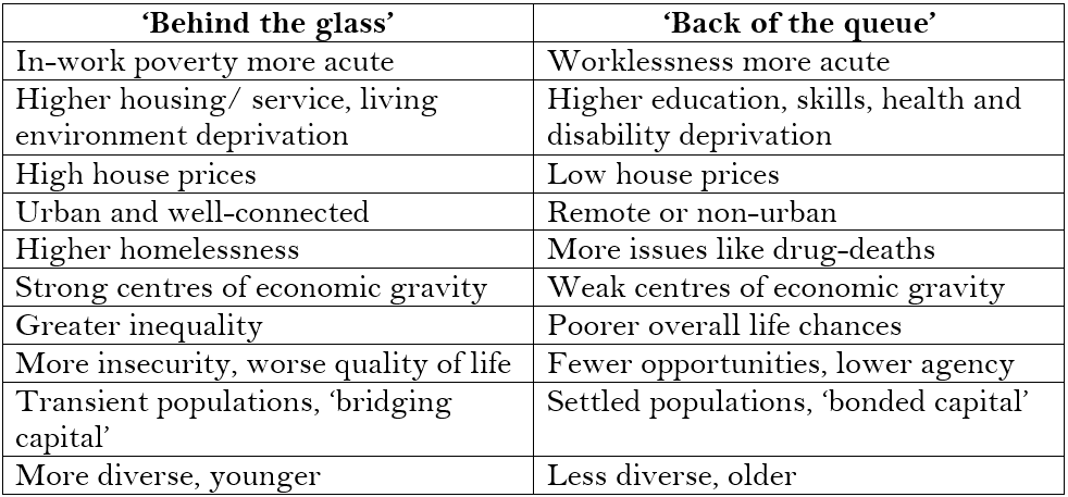
A few years ago, ‘behind the glass’ areas gravitated towards Corbynite iterations of Labour and ‘back of the queue’ areas gravitated towards Johnsonite iterations of Toryism. But now, voters in these two types of place are moving beyond the main parties – to the Greens and Reform, respectively.
Below, to illustrate this, are two constituencies which in many ways exemplify the ‘two deprivations’ – despite being just six positions apart according to the overall IMD rankings.
The first, Islington North, has a clear left slant, at the expense of Labour. In its case the beneficiary is Jeremy Corbyn, of course, who held the seat in 2024 even after his expulsion. But the types of challenges there are exactly the sort of ‘behind the glass’ factors which are likely to produce Green wins in future.
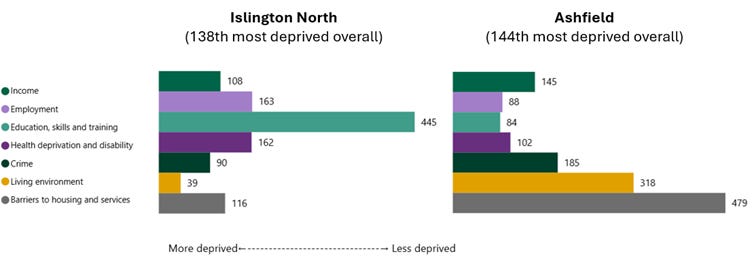
Ashfield, meanwhile, is archetypally ‘back of the queue’. It was Labour for years, prior to Lee Anderson winning it for the Tories in 2019 and then for Reform in 2024. Poverty in this Red Wall constituency is of the composition – educational and health deprivation, combined with high worklessness and low housing deprivation – which seems to make a place more amenable to Anderson’s brand of politics.
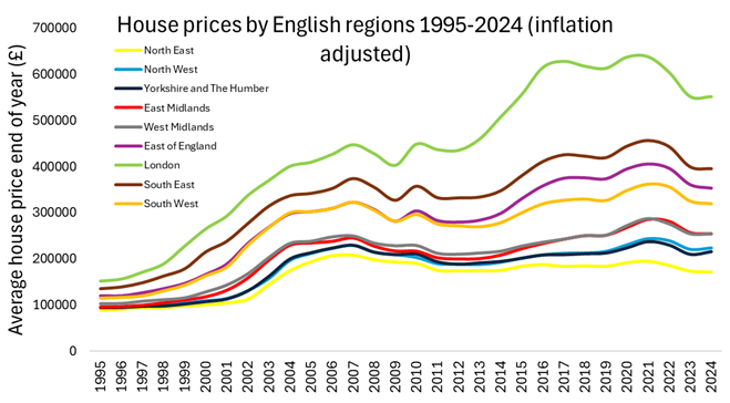
A generation or two ago, Ashfield and Islington North would not have had quite such diametrically opposed politics – cultural differences notwithstanding. The chart below illustrates why the gap has opened up. It shows the average house prices for all nine English regions over time, taken from ONS data and adjusted for inflation to reflect January 2026 prices.
The vast differences in the economic centre of gravity in London compared with elsewhere – reflected in the capital’s skyrocketing house prices – have created massively different types of challenge in the respective places.
This means that, whilst not completely mutually exclusive, the two deprivations often tend to be pulling in opposite directions. Gorton and Denton is one of a number of hybrid seats where they combine – or, rather, are in tension – within a single seat. Hence why both the Greens and Reform increased their votes, and why it is so hard to extrapolate wider meaning from the result last Thursday.
Many of the other hybrid seats are in very poor parts of Birmingham or Greater Manchester; places which have the urban diversity of ‘behind the glass’ areas, but the lack of opportunities more commonly found in ‘back of the queue’ constituencies.
Caveats
There are limitations to my ‘two deprivations’ analysis, of course. Few seats fit the characteristics as neatly as Islington North of Ashfield, for starters; I’m talking only in terms of the broadest patterns.
And it’s worth also acknowledging that my analysis is about place characteristics rather than people and demographics. As Rob Ford pointed out, Gorton was amenable to the Greens in large part because of its student and Muslim populations.
On the latter point, however, I’d say that the people and place elements are hard to separate. A large part of the reason why ‘behind the glass’ areas tend to be younger and more diverse, for instance, is precisely because they are the places where new arrivals have headed in search of opportunities – often living cheek-by-jowl with better-off residents, or in highly transient communities.
There are diverse seats with the ‘back of the queue’ type of deprivation, such as Wolverhampton North East, mentioned above. But generally, the reason populations are older and less diverse in ‘back of the queue’ areas is because they have weaker centres of economic gravity.
Conclusion
A striking facet of the ‘two deprivations’ is how little each truly knows the other. I’m often struck, in focus groups with voters, by the gilded lives they imagine people live in other parts of the country.
This unknowability will only grow, if ‘behind the glass’ and ‘back of the queue’ areas move further apart. And it creates a fertile territory for the politics of grievance and caricature. This is embraced by populists like Farage, but indulged by mainstream figures too, when it suits them.
In response to the Gorton and Denton by-election, for instance, one Labour source allegedly said the party was ready to “sacrifice bourgeois support” in certain parts of the country, to retain backing in Reform-leaning areas. The analysis above illustrates how flawed this ‘bourgeois’ characterisation is.
It’s true, of course, from a Labour perspective, that there are more places with ‘back of the queue’ deprivation than ‘behind the glass’ deprivation. But it’s also true that ‘behind the glass’ places are the last stronghold Labour has that could be said to resemble a long-term base. Jettisoning this seems highly risky, and a more sensible approach would be to find ways to unite the two deprivations. This will probably not involve foregrounding immigration in the way the government currently is – given that this is a topic which seems certain to cleave the two apart.
The real implication of my ‘two deprivations’ analysis is a situation from which everyone loses. In the parts of the country where you can get a good job, you can’t get a good house; in the parts of the country where you can get a good house, you can’t get a good job. Whichever way around you have it, the pathways to success are blocked.
Unless politicians address this better in the next decade than they did in the last two, ‘behind the glass’ and ‘back of the queue’ areas will continue to move apart – making a political settlement which advances social justice close to impossible.